I paint with my local art group which is Bandon Art Group. We have a Facebook page but also our own website which we all have a page on to show our work. Today I updated my page with all my latest work so it is now up to date. If anyone would like to check it out they can do so here
Derwent Procolour Review part 2
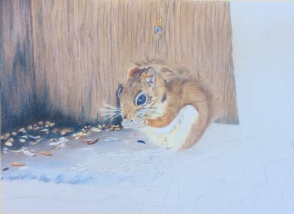
Art, Color pencil, Colored Pencil, Colour pencil, coloured pencil, Derwent Procolour, Luminance, Polychromos, WildlifeIn my first review for Procolour I was a bit unsure about them and so a little ‘on the fence’. I decided the small trial I gave them was unfair and so when I took the photo of a squirrel hogging the bird food I knew this was going to be a fairer test. I also wanted to see how they worked when used with Polychromos and Luminance and again this piece would give me chance to find out.
I made the decision before I began to use the Procolour for the background as I wanted the soft, less vivid effect here, and to use the Polychromos for the squirrel. Luminance as usual would be used when I needed either the colour or the effect of them.
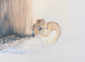 This was early on and the Procolour were used for the wood at the back and also the seeds and floor. The blue at the front was where the Luminance came in.
 I found the Procolour perfect for the wood and floor. They went on easily, blended well and kept the softness of colour I was looking for. The only problem I had was that the pencils seemed to soak into the paper support overnight and I was needing to add additional layers the next day. I was working on Stonehenge and know I am not the only person to experience this with Stonehenge so am pretty sure it was the paper and not the pencils. This is not a support I usually use and would be slow to use it again to be honest.
 I continued throughout Procolour on the background, Polychromos on the squirrel and mainly Procolour with some Polychromos and Luminance on the floor.
 I am delighted with the finished piece and in how the Procolour performed. I think like all pencils it is fitness for purpose and here they suited my purpose perfectly giving me exactly the result I was hoping for when I purchased them.
I am now looking forward to using them alongside my other pencils in the future.
Derwent Procolour Review
Art, Colored Pencil, Colour pencil, coloured pencil, Derwent Procolour
I have lusted after these pencils ever since I saw two artists post test pictures using them, well before they were available to buy. I think it was the softness and subtlety of the colours that got me. Now at last I have them in my possession.
I will apologise now for the lack of video but I’m just a hobby artist not a professional and I’m not even sure how to set a video up let alone edit one. So here we go, a written review with a few pictures.
The Procolour pencils arrived in the tin as shown above and yes I did order all 72 without trying them 😂 With its lid on the tin is quite solid but without, the metal bends about easily. Not a problem for me as I have pastel drawers that hold all my other pencils so these will join them in time but something to be aware of if you store yours in the original tin.

My pencils were purchased from the SAA and arrived with a free Derwent pad so I decided to try my new Derwent pencils on the new Derwent paper, well it was new to me anyway.

As you can probably see from the photo above, the pencils arrived sharpened but not sharp and being impatient I didn’t stop to sharpen any. I also knew I was going to work with them properly to test them and so it was fine, they could be sharpened then. Considering the pencils were blunt, on the whole they covered well. The paler ones covered less well than the darker ones but perhaps with less intensity of colour that’s to be expected. It should also be noted that it is a lot of the paler ones that have low light fastness so maybe they won’t get used much anyway.
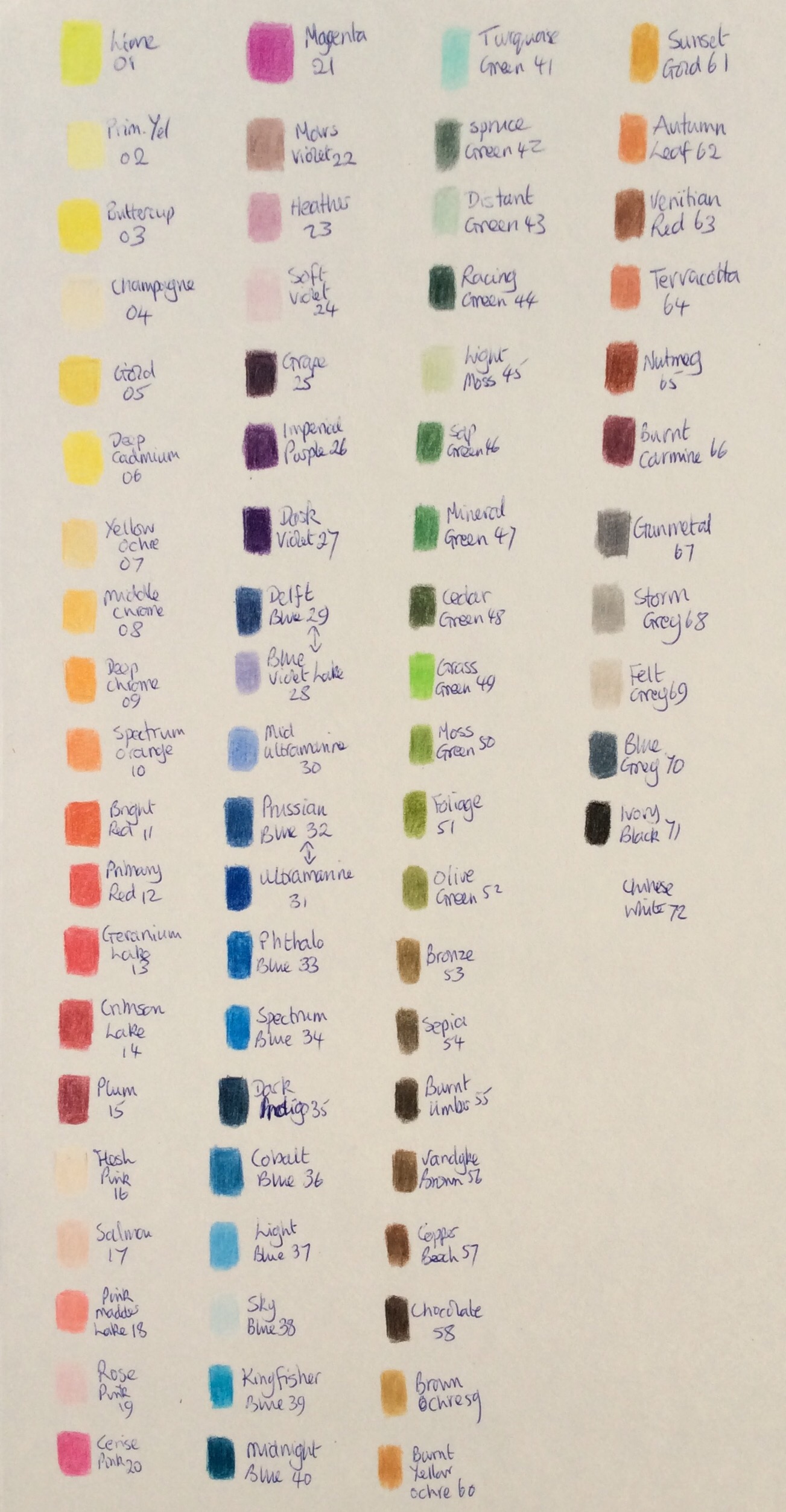
As you can see I just quickly tested each colour and made a note of its number and name alongside. I think this gives an idea of the colour range and the coverage. I didn’t blend, just coloured.
I was actually impressed with the range of greens. Nice to find some that I might use rather than having to mix mine all the time. One bright grass green but all the rest soft and more natural than other ranges carry.
Those eagle eyed amongst you may notice a couple of pencils in the wrong order. The first was due to whoever packed them getting two transposed, the second was me being distracted.
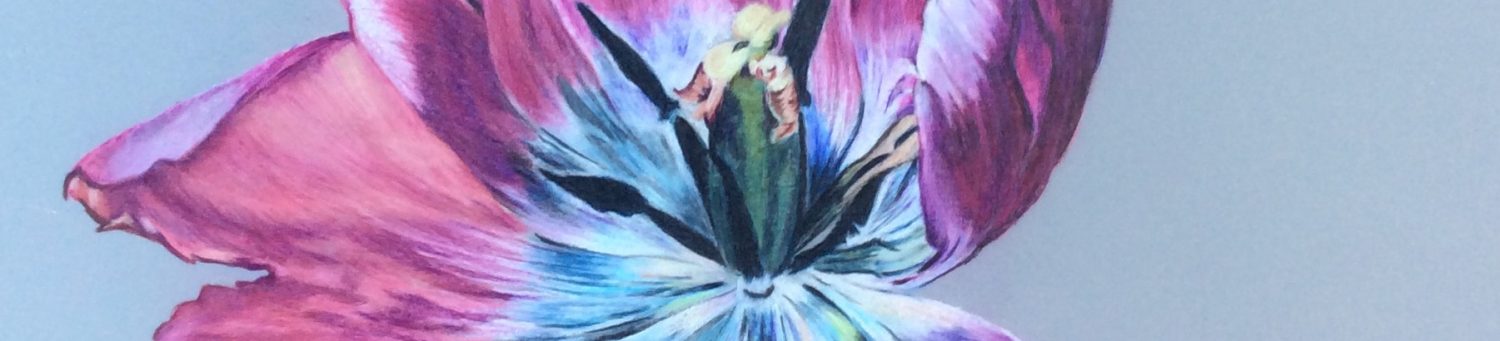
My next test was a Fuschia flower and I worked from a picture I took of one in my garden. This may not have been the best test due to the vibrancy of the fuschia and the muted subtle colours of the Procolour! My bad!
I began working on the reds with a small selection of Rose Pink, Yellow Ochre, Middle Chrome , Spectrum Orange, Bright Red, Geranium Lake, Crimson Lake and Primary Red. Once I began working I realised these were not enough and added Soft Violet, Cerise Pink, Plum, Champagne and Chinese White to the mix.
 This is my first day’s work and so far this is my experience:
- Harder than Coloursoft, softer than Artists in terms of Derwent
- Harder than both Luminance and Polychromos
- Hold a good point
- Sharpen well and fit the Derwent Superpoint Mini
- Some dust when blending but not as much as other makes
- Blend well with lighter colour pencils and with the Derwent Blender pencil (I don’t use OMS so haven’t tried that)
- All but some of the darkest colours lifted off easily with eraser and Derwent Battery Eraser
- Any pencil lines need to be cleaned off before working as the lighter colours pick them up and they then become hard to remove.
- At the moment these 72 colours seem way too few even when mixing them.
- Darker colours go on like a dream
I gave up totally with Rose Pink, Champagne and Soft Violet as they barely showed up on the paper. This is probably no hardship though as, as previously stated, these all have very low levels of lightfastness. They were though useful to blend with. I also found that although I liked the paper and it took around 10 layers of the other colours with these three I actually broke the surface of the paper trying to get them to show. This is unusual for me as I always work with lots of light layers and am not especially heavy handed.
The colours really do lack the vibrancy of makes such as Polychromos or Luminance which I can hardly complain about as it is exactly the reason I was drawn to them in the first place. I can see them being a great addition to my current hoard of Coloursoft, Polychromos, Luminance and the odd Artists Pencils as they do bring a quality of colour that the others do not.
I want to do much more with these pencils and will post again when I have more to show. I was holding off posting this until I had more photos and had tried them mixed with Luminance, Polychromos and Derwent Coloursoft but then realised that some of you might be waiting to decide whether to purchase or not ………
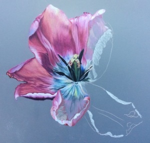
Step by Step – Tulip on Polydraw Drafting Film
Art, Color pencil, Colored Pencil, Colour pencil, coloured pencil, Drafting Film, PolychromosI must start by clarifying that this isn’t really a proper step by step as I hadn’t intended to blog this until I was asked to. I worked in Polychromos but as any pencils can be used I am not really specifying colours although am mentioning a few when they have been used to mix.
Apologies for the changing colours especially of the background which is all to do with light quality when I took the photos. I really hadn’t been intending to share in this way so only took them for my own use as I worked. I always do this as it really helps me see what I need to do next and anything that looks ‘wrong’.
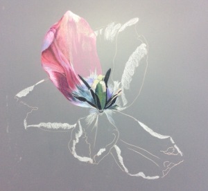
I began by drawing my tulip lightly using a light coloured pencil. As you can work on both sides of drafting film on the reverse I lightly shaded in the lightest areas and dark stamen to create some depth. All the way through I only used the pencils themselves to blend.
The first petal shows the stages of very light layering and the way colour is used to build up contour and depth.
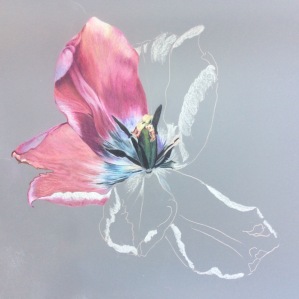
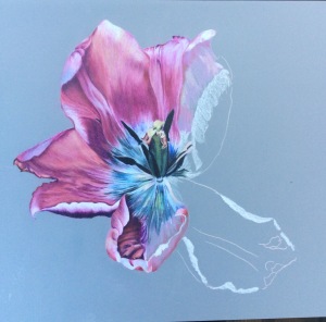
Here you can the completed petal and again the light layers on the second one. It really is a question of slowly building up the colour. The lilac colour on the edge is a mix of pale pink and sky blue. Towards the centre I have laid in white and then started to overlay colour. I have also deepened the light layers on the stamen working on the front this time.
Working gradually to build up the layers in the second petal and layering indigo and mauve on top of the pinks on the outer edge to create the shape.
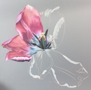
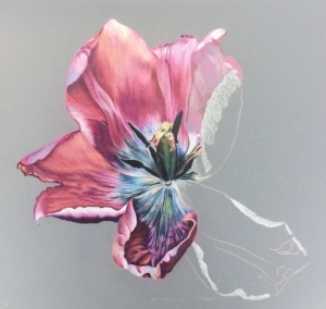
I am now beginning to lightly layer the third petal which as you can see is much lighter than the first two. Although white will go over other colours on the drafting film I did try to maintain the white wherever possible.
This shows the completed third petal and the light layers at the start of the fourth (lower) and fifth (upper) petals.
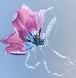
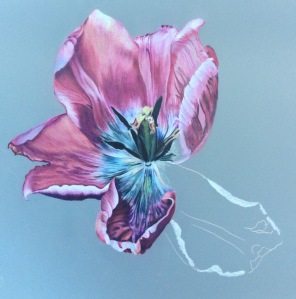
In order not to lay on the work already completed I decided to focus on the fourth petal, still building up layers slowly.
I then continued using light layers and colour to show the contours of the petal until I was happy with the depth of colour and tone.
Out of all the petals it was this, the fifth petal that gave me most grief. I am not sure if it was the markings on it or the shape of it but all I could do was persevere laying down the light layers of colour and looking closely at the markings.
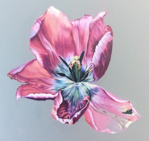
Here you can see the finished fifth petal and the beginning of the final one.
As the final stage is complete I checked to see if my darkest darks and lightest lights were ok. If needed I could have now gone to the reverse of the drafting film and worked there deepening and lightening to create the depth I wanted.
If I had reached saturation point on the front of the film or had managed to strip away or polish the surface of the film so it wouldn’t take any colour I could have also used the back of the film to fill in any gaps.
For those who wonder why drafting film let me share with you the one I did on the tracing type paper use to separate layers of drafting film. I hasten to say I did this in error not deliberately. 
Same colours and make of pencil used but as you can see the vibrancy and translucency that drafting film gave me is absent.
Drafting Film – What it is and a few tips for coloured pencil use
Art, Color pencil, Colored Pencil, Colour pencil, coloured pencil, Drafting Film
The drafting film we use for coloured pencil work is the same as that used by draftsmen and architects. There are several makes of drafting film suitable for coloured pencil work and it comes in both packs cut to size or in rolls. It comes in gloss and matt surfaces but the most useful form for coloured pencil work is Double Matt which means it is matt on both sides. The best known make of drafting film is Dura-lar, but the only one I have used is Polydraw.

Working in drafting film is quite different to working on paper. The biggest differences I noticed were that some of my colours looked quite different on the drafting film and they appeared to blend together differently. This means you do need to pay attention to what you are getting on the support and adjust colours accordingly. Colours though do appear brighter, more vibrant and more translucent.
Before I go any further I do have to say that I have only used drafting film once, and then only with Polychromos. So from this great wealth of experience these are some of the other things I have discovered so far:
1. Make sure you have the actual film and not the tissue type paper that separates the sheets. I promise I will show you the difference in a later blog as I made this exact mistake.
2. There is much more pencil dust from working on drafting film than there is when working on paper so make sure you have a soft brush to brush away any coloured dust.
3. Light layers are the way to go, it will take lots of these as long as they are really light.
4. If you press too hard any marks you make will show. Some can be blended out, depends on how hard you have pressed.
5. Do NOT use a battery eraser. It leaves the surface too shiny to take any colour.
6. Do NOT use a Derwent blender pencil as it takes off any colour you have laid down. This is the only one I have so I don’t know how any other blenders work.
7. Blend with paper stumps or even better with the pencils themselves.
8. Don’t worry if the front of the film stops taking colour as you can use the back of the film to fill any gaps.
9. You can work on both the front and back of the film. This adds depth to colour or can be used to create depth in terms of distance.
10. Do keep your pencils as sharp as possible at all times. The sharper they are the easier it is to work.
One artist who has worked extensively with drafting film is Karen Hull and she has a great piece on it here which also includes links to her tutorials.
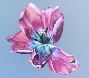
Serenity
Art, Color pencil, Colored Pencil, Colour pencil, coloured pencil, Luminance, Polychromos, Portraits
‘Serenity’ is my latest coloured pencil painting and is of a Maiko I was fortunate to meet whilst in Japan last year.
Throughout Japan I had lots of opportunity to see people, men, women and children in traditional costume and to take photographs but it was in Kyoto that I had the pleasure of meeting the Maiko who became the subject of ‘Serenity’.
A Maiko is a young woman who is training to be a Geisha, a journey which is both long and gruelling. As part of their training Maiko learn to become accomplished musicians, singers, dancers and conversationalists. When travelling in a group, as I was, it is sometimes possible to attend as dinner where a Maiko performs for the group, otherwise attendance at such a performance would be by invitation only.
The Maiko who performed for us was very young, graceful and unusually happy to talk with us, answering our questions and allowing us to take photographs. Many such photographs are carefully posed, with hands and head held in specific positions but with such amazing access it was possible to catch off guard moments too. It was such photographs that I chose to use for this work.
Having met the Maiko it was important for me not just to capture her likeness but something of her essence, the way she held herself and the sense of peace she carried with her.
The following work in progress pictures show how the image came to life, as usual by slowly building up layers of colour to create depth and texture. Clicking on the photos will bring up larger images.


Colour Pencil Certificate
Art, artwork, Color pencil, Colored Pencil, Colour pencil, coloured pencil, PortraitsI recently finished a Colour Pencil Certificate with the London Art College. It’s distance learning but with a tutor to whom you submit assignments and in return receive useful and constructive teaching/feedback. In the blurb it said that the course work takes around 6 months but that students have up to two years to finish which was just as well as I took 23 months. I’m not sure whether it’s that I work slowly, if I miscalculated the time,or if I took lots of breaks, but it was suggested to take 8-10 hrs for each piece of work whereas they took me anything from 25hrs to 60hrs +!
Anyway, I am now all done and very happy to have received a Distinction 🙂
I was also asked to write a blog post about my assignments for the college and if you are interested you can click here to read my blog and see my course work in its entirety.
In the blog I include my current WIP which is in fact now finished and so I will include the completed work here, slipped behind a mount so it gives some idea of how it will look when its ready to be framed.

Fabric in Coloured Pencil
Art, artwork, Color pencil, Colored Pencil, Colour pencil, coloured pencil, Portraits, Work In ProgressThe last two pieces I have worked on have involved fabric. The next piece I do I am hoping to take a break from it although as I have so many lovely photos from our last trip which was to Japan, many of which involve kimonos that might be easier said than done.
Having said that I have learnt so much about making fabric look like fabric that it has all been good practice. For me the secret has been not to look just at the colour but at the flow of the fabric, the lines that it takes and to make my strokes follow them. Now I am writing about it I realise that it is a bit like doing animal fur, making the lines follow the direction that something lies in rather than doing mown thing.
It’s not finished yet, it’s still a work in progress but I am getting there 🙂


Work in progress – still
Color pencil, Colored Pencil, Colour pencil, coloured pencil, Portraits, Work In ProgressI always like to see how a piece of work develops over time especially with coloured pencil paintings. I think we all go though the stage of thinking the work is ugly and that it’s probably not working only for it then to begin to take shape and become something reasonable (most of us amateur artists would never use the work ‘good’ about our work). This is one of the reasons that I take photos each time I stop working on a piece. Plus it is also always good to look back and see exactly how a piece has taken shape.

The other reason I take photos is that it is only by looking at a photo that I can really see what is wrong with a piece and what is working. All too often I fail to see something when working on top of it, only to see it clearly in a photo. Others use a mirror or turn a piece upside down, me, I take photos.

The light in some of these is not particularly good as they were taken with my phone due to a broken iPad and a flat camera battery but they serve the purpose for me anyway and provide a record of how the piece has grown so far.

Luminance and Polychromos
Art, artwork, Color pencil, Colored Pencil, Colour pencil, coloured pencil, Luminance, Polychromos, Portraits, Work In ProgressMy struggle the last couple of weeks has been not to use one or the other but to work out how Luminance and Polychromos work together and to understand the similarities and differences.
Before I purchased Luminance pencils I sought information online from others who used them. Apart from one person who sold theirs on because they couldn’t get on with them, everyone else seemed to love them. I read reviews as well as comparisons but really the only way is to try them for yourself.
If I had made my mind up last week I’d have been all set to box them back up but two weeks in I am beginning to appreciate Luminance. They are though very different to Polychromos and its taken me this long to work out why, apart from one being wax and the other oil that is.
Where Polychromos are translucent, like to be layered gently, building up the colour to something vibrant and glowing, Luminance are opaque, soft, mute almost and don’t like being layered as much. When you use a light coloured Polychromos over other Polys it blends, when you do the same with a light colour Luminance it can blend but equally it can shift the lower layers around, I’ve yet to find the tipping point but I am sure I will.
Last blog post I thought I’d been using Polys on top of Luminance but this time I tried on top, underneath and in the middle. Effects are different but they work all ways now I understand them a bit more 🙂
This is still a WIP but with every little bit I do, as with everything, I am learning a little more.


You must be logged in to post a comment.